17. Extra: Swarm Plots
Swarm Plots
In this lesson, you saw many ways of depicting the relationship between a numeric variable and a categorical variable. Violin plots depicted distributions as density curves, while box plots took a more summary approach, plotting the quantiles as boxes with whiskers. Another alternative to these plots is the swarm plot. Similar to a scatterplot, each data point is plotted with position according to its value on the two variables being plotted. Instead of randomly jittering points as in a normal scatterplot, points are placed as close to their actual value as possible without allowing any overlap. A swarm plot can be created in seaborn using the swarmplot function, similar to how you would a call violinplot or boxplot.
plt.figure(figsize = [12, 5])
base_color = sb.color_palette()[0]

# left plot: violin plot
plt.subplot(1, 3, 1)
ax1 = sb.violinplot(data = df, x = 'cat_var', y = 'num_var', color = base_color)

# center plot: box plot
plt.subplot(1, 3, 2)
sb.boxplot(data = df, x = 'cat_var', y = 'num_var', color = base_color)
plt.ylim(ax1.get_ylim()) # set y-axis limits to be same as left plot

# right plot: swarm plot
plt.subplot(1, 3, 3)
sb.swarmplot(data = df, x = 'cat_var', y = 'num_var', color = base_color)
plt.ylim(ax1.get_ylim()) # set y-axis limits to be same as left plot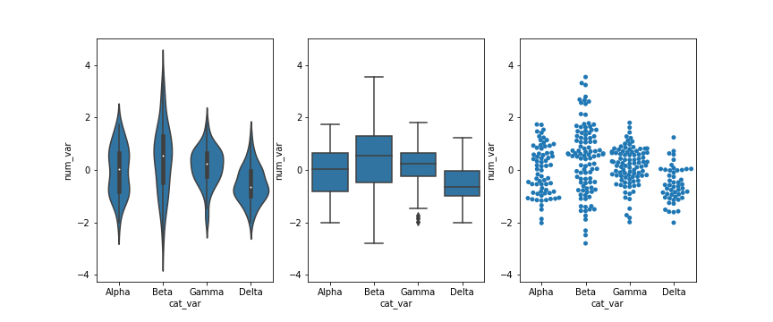
Looking at the plots side by side, you can see relative pros and cons of the swarm plot. Unlike the violin plot and box plot, every point is plotted, so we can now compare the frequency of each group in the same plot. While there is some distortion due to location jitter, we also have a more concrete picture of where the points actually lie, removing the long tails that can be present in violin plots.
However, it is only reasonable to use a swarm plot if we have a small or moderate amount of data. If we have too many points, then the restrictions against overlap will cause too much distortion or require a lot of space to plot the data comfortably. In addition, having too many points can actually be a distraction, making it harder to see the key signals in the visualization. Use your findings from univariate visualizations to inform which bivariate visualizations will be best, or simply experiment with different plot types to see what is most informative.